Brand Strategy & Identity
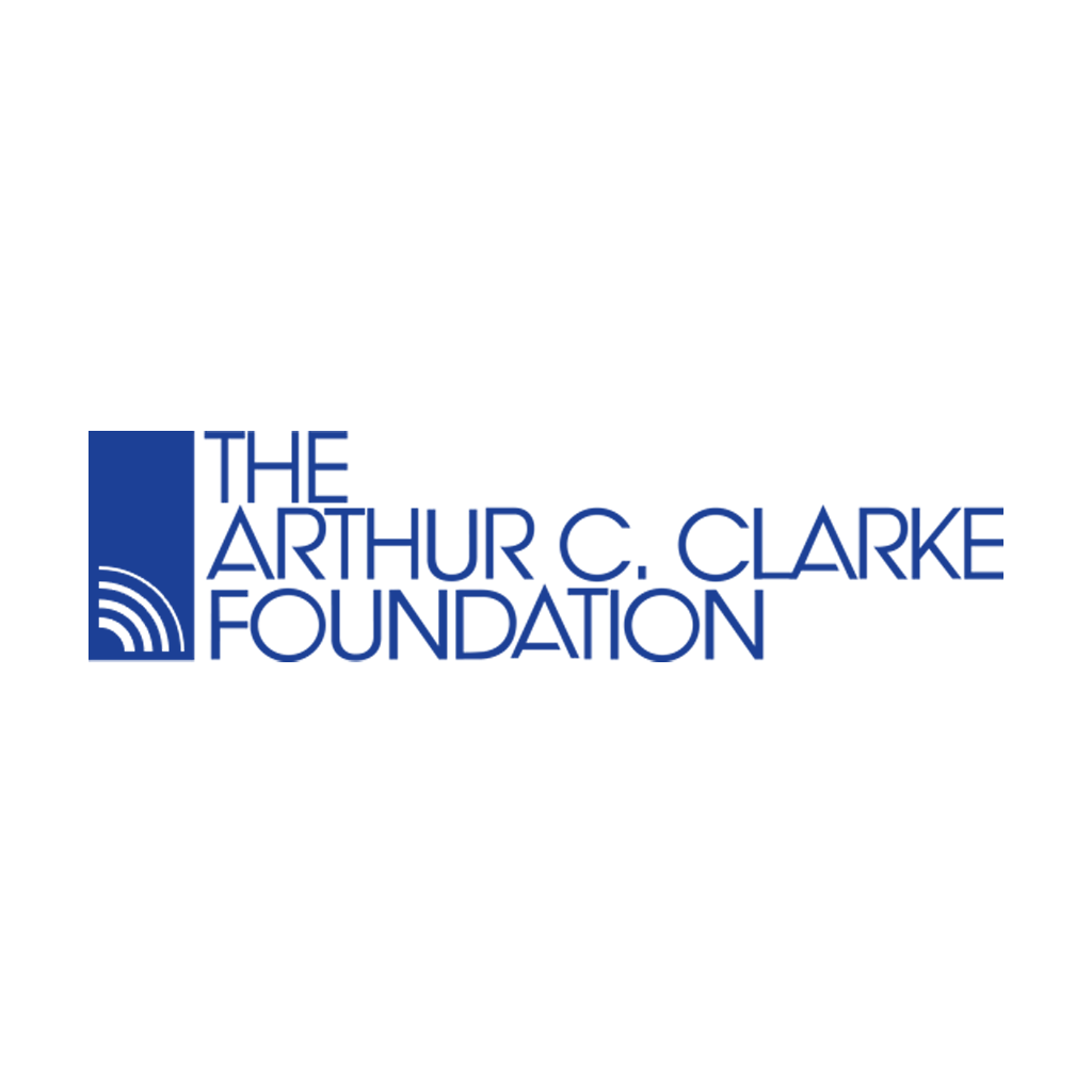
The Arthur C. Clarke Foundation
The Arthur C. Clarke Foundation was fledgling when this identity was commissioned — a new organization advancing the author's insights into science, literature, and social concerns, needing an established visual presence to seek funding and build institutional credibility.
The mark needed to carry the weight of Clarke's name: forward-looking, authoritative, and built to last. The resulting logotype — a vertical mark pairing a geometric signal-wave icon with a clean stacked wordmark — was designed to establish the foundation's identity at its most critical moment. It remains in active use on the foundation's website today, more than 25 years later. Longevity is the ultimate proof of identity work well done.